Talk:Selection Policy: Difference between revisions
From ParaQ Wiki
Jump to navigationJump to search
No edit summary |
|||
| (2 intermediate revisions by 2 users not shown) | |||
| Line 1: | Line 1: | ||
This approach seems right for a first pass. If it's wrong, we'll all feel it when we use it, and the customers will scream until it's right. | This approach seems right for a first pass. If it's wrong, we'll all feel it when we use it, and the customers will scream until it's right. | ||
--[[User:Hollywood|Hollywood]] 17:29, 20 Jul 2006 (EDT) | --[[User:Hollywood|Hollywood]] 17:29, 20 Jul 2006 (EDT) | ||
== Hint Box == | |||
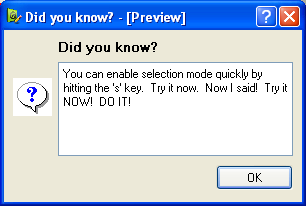
Communicating spiffy features like hot keys to users is difficult. How is a user to know that (s)he can quickly select by hitting the 's' key? | |||
One fairly easy solution implemented by lots of applications is to use a hint box like the one below. It's not uncommon to have a "tip of the day" dialog at program startup, and that should be simple to implement. | |||
[[Image:HintBox.png]] | |||
:Someone implement this already :-) I have been doing all this selection testing without a bloody shortcut. [[User:Berk|Berk]] 14:26, 27 Jul 2006 (EDT) | |||
Latest revision as of 13:26, 27 July 2006
This approach seems right for a first pass. If it's wrong, we'll all feel it when we use it, and the customers will scream until it's right.
--Hollywood 17:29, 20 Jul 2006 (EDT)
Hint Box
Communicating spiffy features like hot keys to users is difficult. How is a user to know that (s)he can quickly select by hitting the 's' key?
One fairly easy solution implemented by lots of applications is to use a hint box like the one below. It's not uncommon to have a "tip of the day" dialog at program startup, and that should be simple to implement.
- Someone implement this already :-) I have been doing all this selection testing without a bloody shortcut. Berk 14:26, 27 Jul 2006 (EDT)
