ParaView Usability Improvements: Difference between revisions
| Line 56: | Line 56: | ||
: <font color="purple">I like the first idea. I hate the second one :-) It is hard but if we get a good interrupt mechanism (including for rendering/compositing), ParaView would become much more usable. When I say "good interrupt mechanism", I mean one that works as if there is no difference between a pipeline executing and not executing when it comes to user interactivity. In my opinion, this is worth spending several months of effort. --[[User:Berk|Berk]] 12:00, 1 March 2010 (UTC)</font> | : <font color="purple">I like the first idea. I hate the second one :-) It is hard but if we get a good interrupt mechanism (including for rendering/compositing), ParaView would become much more usable. When I say "good interrupt mechanism", I mean one that works as if there is no difference between a pipeline executing and not executing when it comes to user interactivity. In my opinion, this is worth spending several months of effort. --[[User:Berk|Berk]] 12:00, 1 March 2010 (UTC)</font> | ||
<font color="darkred">Another idea would be to have ParaView default Autoapply to On - or, have ParaView autoapply on up to some threshold. Over that threshold (data size), have a dialog box come up saying that we are shifting to manual mode. --[[User:Alan|Alan]] 12:00, 30 March 2010 (UTC) </font> | |||
==Window Layout== | ==Window Layout== | ||
Revision as of 14:23, 30 March 2010
For ParaView 4.0, we are planning to revamp the user interface to make it more intuitive and easy to use. This page can serve as the scratch-pad for coming up with improvements.
Compact object inspectors
- Object inspector panes can be too spaced out with large widgets. They should be redesigned to be compact and small. The idea being that the user can leave it floating around as a toolbox without consuming too much screen space.
Separate Simple & Advanced Object Inspector
- The first tab in the object inspector will be a "simple" inspector listing only the most important filter properties and relevant display options.
- For all other options the user can go to the "advanced" tab, which will list other advanced filter properties and display properties.
Style for Object Inspector
- Style the object inspector as a "toolbox" or properties page.
- Is this a single panel that always follows the active object (as it is now), or is there a separate panel for each object? I can see how switching could reduce the cognitive load, but it also explodes the number of panels. VisIt does it that way, and I hate it. --Ken 02:41, 27 February 2010 (UTC)
- It would still be a single panel, following active source like current ParaView. Utkarsh 05:33, 28 February 2010 (UTC)
- Instead of using tabs use icons that the user can click on to switch from basic to advanced view.
- Should it be icons and strings? There is enough room for words, isn't there? --Ken 02:41, 27 February 2010 (UTC)
- Does information tab really belong here?
- Where else would it go? --Ken 02:41, 27 February 2010 (UTC)
.
Click to select objects
- Currently user needs to click on the pipeline browser to activate an object, he should be simply be able to click in the 3D view to select it. This conflicts with the interaction mouse clicks so perhaps use "Ctrl+Left Click" to select an object or vice-versa.
I added the following. They should be confirmed or vetoed by the group. --Ken 16:11, 27 February 2010 (UTC)
- A right click in a 3D view brings up a pop-up menu. When the right click happens over an object, there should be menu items pertaining to that object. possible items for this list include
- Hide
- Submenu to select solid color/field color
- Change color/color map
- Submenu for representation
- What will there be in the representation submenu? Some of these may work well in what Utkarsh called Filter Controls toolbar. I think it should be called Quick Edit toolbar. I recommend taking a look at OmniGraffle 5 for an example. --Berk 11:52, 1 March 2010 (UTC)
- I believe Ken meant, the representation type like "Wireframe/Surface" etc. I think that's not too bad esp. if we have show/hide in the menu. Utkarsh 15:42, 2 March 2010 (UTC)
Better Drag and Drop
- User should be able to drag sources/filters from the pipeline browser into a view to show it in that view. Avoids the whole "active view" confusion.
- Love it -- Berk 11:55, 1 March 2010 (UTC)
- Same can be extended to drag-n-drop filters from toolbars (eg. common filters toolbar) to create them.
- Hate it. Toolbar button should be click only -- Berk 11:55, 1 March 2010 (UTC)
- You could change this idea to a dock widget with a user-customizable list of filters which could be dragged to the pipeline. If it was docked on the right the user could always see a list of their favorite filters and grab them as needed without having to go to the menus. -- Emonson 14:08, 1 March 2010 (UTC)
- User should be able to drag and drop filters in the pipeline browser to restructure the pipeline. Care must be taken to handle multiple input filters correctly.
- Love it -- Berk 11:55, 1 March 2010 (UTC)
Pipeline Browser
- Add a flat view mode to the pipeline browser.
- Show a 'X' next to the filters to quickly delete them.
Apply/Reset Button
- Apply/Reset button is too fundamental to be on the "Object Insector".
- It could be somewhere in the application window, maybe small buttons at the bottom of the screen or something.
- However this may mean that every time the user changes properties in the "Object Inspector" he has to "move over" to click apply which may not be such a good thing. Or we keep it in both places.
Here is a crazy idea. What if there was no apply/reset buttons and everything just auto-applied? I know what you're thinking. You can't have things always auto-applying because ParaView would become unusable with large data. But what if there was a viable interrupt mechanism? While the pipeline is updating we keep the GUI alive by allowing window events during the update progress. If the user makes a change that effects the pipeline, the current execution is aborted and a new one started. --Ken 16:31, 27 February 2010 (UTC)
Here is another idea (along with the auto-apply everything). Recently a user on the mailing list suggested that there be a pause between the last interactive render and the following still render. That is a great idea (when is it being implemented?). Perhaps the same could work with apply. When the user makes a change, a apply countdown starts (user settable time defaulted to 5 sec?). There could be visible feedback on that, like a button in the status bar counting down time. The user could click the button to make the apply take effect immediately. There could also be a cancel button, which would be the equivalent of reset. Perhaps there could also be a pause button so the user could stop the countdown to make more changes at leisure. Note that this feature could be implemented independently of the previous one, although I think this one would make the previous one more useable. --Ken 16:31, 27 February 2010 (UTC)
- I like the first idea. I hate the second one :-) It is hard but if we get a good interrupt mechanism (including for rendering/compositing), ParaView would become much more usable. When I say "good interrupt mechanism", I mean one that works as if there is no difference between a pipeline executing and not executing when it comes to user interactivity. In my opinion, this is worth spending several months of effort. --Berk 12:00, 1 March 2010 (UTC)
Another idea would be to have ParaView default Autoapply to On - or, have ParaView autoapply on up to some threshold. Over that threshold (data size), have a dialog box come up saying that we are shifting to manual mode. --Alan 12:00, 30 March 2010 (UTC)
Window Layout
- The default layout has be a usable layout (with all inspectors etc. etc.). In spite of the user interface being configurable, in general, user tend to stick with what's the default.
Even though most users are right-handed, why are all the panes on the left side by default?- What difference does handedness make on GUI positions? In physical devices it makes a difference because the hand can brush against the right side of whatever they are manipulating. This does not matter on a mouse pad or even a track pad. To me, having the controls on the left or right side is arbitrary. The only driving factor I can think of is that current ParaView users are used to having the controls on the left hand side. (Incidentally, so are VisIt and EnSight users who will be so impressed with our new GUI they'll switch over.) Thus, my vote is to leave the controls on the left hand side. --Ken 16:38, 27 February 2010 (UTC)
- Fair enough. I was just wondering :) Utkarsh 16:42, 28 February 2010 (UTC)
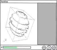
- The VCR control can very well be in the status bar.
Filters
- We don't need to have filters as they are implemented e.g. Extract Block, Extract AMR Level don't need to be separate filters, both are just "Extract Block", we just internally pick the right one based on the actual data type (not the best example, but sure there are others). In other word, filters should the "operations" that you can perform, which implementation is chosen need not have to explicit.
- Automatic processing: point data-to-cell-data and vice-versa, component extraction for filters working on single component arrays alone.
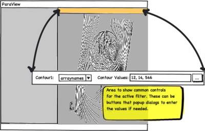
Filter Controls Toolbar
Animations
- The animation keyframe editor layout should be unified with the animation view layout : switching from horizontal to vertical layout is disturbing, and switching from the cue logic to the keyframe logic too. The animation keyframe editor could be replaced by an horizontal animation track editor, which shows the evolution of the given parameter as an editable curve, and provides widgets to interactively modify the values. This editor could be inspired by the transform function editor, but with more than only segments.
Miscellaneous
- Redesign the Change Input dialog, Custom Filter wizard.


