ParaView Usability Improvements
From ParaQ Wiki
Jump to navigationJump to search
For ParaView 4.0, we are planning to revamp the user interface to make it more intuitive and easy to use. This page can serve as the scratch-pad for coming up with improvements.
1. Compact object inspectors
- Object inspector panes can be too spaced out with large widgets. They should be redesigned to be compact and small. The idea being that the user can leave it floating around as a toolbox which consuming too much screen space.
2. Separate Simple & Advanced Object Inspector
- The first tab in the object inspector will be a "simple" inspector listing only the most important filter properties and relevant display options.
- For all other options the user can go to the "advanced" tab, which will list other advanced filter properties and display properties.
3. Style for Object Inspector
- Style the object inspector as a "toolbox" or properties page.
- Instead of using tabs use icons that the user can click on to switch from basic to advanced view.
- Does information tab really belong here?
Error creating thumbnail: Unable to save thumbnail to destination
New Style Properties Page for Contour Filter
.
4. Click to select objects
- Currently user needs to click on the pipeline browser to activate an object, he should be simply be able to click in the 3D view to select it. This conflicts with the interaction mouse clicks so perhaps use "Ctrl+Left Click" to select an object or vice-versa.
- If you only support single-object selection, you could "left click" to select and "left click and drag" to rotate. Jeff 20:47, 26 February 2010 (UTC)
5. Better Drag and Drop
- User should be able to drag sources/filters from the pipeline browser into a view to show it in that view. Avoids the whole "active view" confusion.
- Same can be extended to drag-n-drop filters from toolbars (eg. common filters toolbar) to create them.
- User should be able to drag and drop filters in the pipeline browser to restructure the pipeline. Care must be taken to handle multiple input filters correctly.
6. Pipeline Browser
- Add a flat view mode to the pipeline browser.
- Show a 'X' next to the filters to quickly delete them.
7. Apply/Reset Button
- Apply/Reset button is too fundamental to be on the "Object Insector".
- It could be somewhere in the application window, maybe small buttons at the bottom of the screen or something.
- However this may mean that every time the user changes properties in the "Object Inspector" he has to "move over" to click apply which may not be such a good thing. Or we keep it in both places.
8. Window Layout
- The default layout has be a usable layout (with all inspectors etc. etc.). In spite of the user interface being configurable, in general, user tend to stick with what's the default.
- Even though most users are right-handed, why are all the panes on the left side by default?
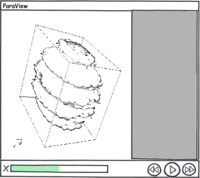
- The VCR control can very well be in the status bar.
