GUI Spacing
This page captures ongoing issues with GUI Spacing. As the GUI changes, so will this page. Eventually, when we agree on the GUI spacing, this page will become obsolete.
Information Panel
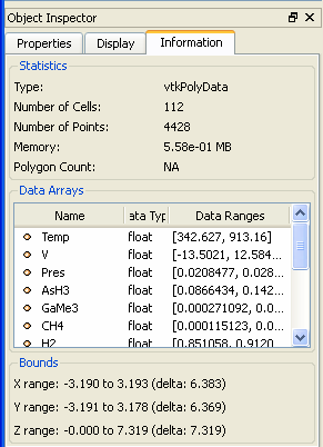
The spacing in the Information tab seems to be, by far, the best example of spacing in the current ParaView GUI. The spacing is excellent both inside and outside of the group boxes. The only complaint, and it’s a minor one, is that the vertical spacing between labels (e.g. between X range and Y range and in between Type and Number of Cells) is a little bigger than it needs to be. It even looks pretty good on the Mac, which pads everything with extra pixels because of the rounder widgets and bigger fonts.
Display Panel
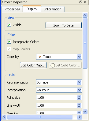
The Display panel isn’t quite as nice. Compare the Display tab to the Information tab and you will see that the Information tab is much more information rich. I also find that the tighter spacing makes the groups more pronounced, and it’s actually easier to find the information that I am looking for. The spacing around the groups, both inside and outside, is much larger. It would also help if the spacing between widgets was also reduced.
Another problem is that the "Transformation" controls are causes the rest of the groups to be unnecessarily large and is stretching them, in some cases like on my Mac, past the horizontal limits of the window. Clint had a good idea to replace the three spin boxes for each parameter with a single three value spin box (like is common for time box entries). How difficult is that to implement.
Properties Panel
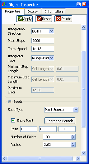
In general, most of the source/filter Properties panels suffer from the same shortcomings of the Display panel. In general, the spacing is still larger than need be. The stream tracer still seems to be the most problematic, simply because it has many complicated parameters that interfere with good layout. This layout could benefit from the following changes.
- Like the Display panel, the spacing inside and outside of the groups is excessive. It should be nice and tight like the Information panel.
- There is this weird thing that is happening in the "Seeds" group where the widgets underneath "Seed Type" are indented more. This is probably because those widgets are in a stack widget, which adds its own padding. The stack widget should be changed to add zero padding.
- It might help to have widgets like the Integrator Type chooser span all the way to the right side of the panel (that is, cover two columns in the table layout). That would help prevent long entries like "Runge-Kutta 4-5" from stretching out the panel.
- Again, it looks like those triple line edits for entering a 3-vector (in this case in the "Seeds" group) are stretching everything out. This would be another good application for that triple value spin box.
- Although this doesn't really help the spacing, it might make the controls easier to view if there was another group. That is, split the "Stream Tracer" group into two groups: a "Streams" group containing the "Vectors", "Max. Propagation", "Initial Step Length", and "Integration Direction" parameters and a "Integrator" group containing the "Max. Steps", "Term. Speed", "Integrator Type", "Minimum/Maximum Step Length" and "Maximum Error" parameters. The latter group could be moved to the bottom like in ParaView 2.
Other Dialogs
Other dialogs are missing nice, tight spacing. In particular, the default spacing inside and outside of groups as well as between widgets is too great. This is evident in both the Settings dialog as well as the Color Map Editor dialog.


