Default Color Map
While at lunch recently I was flipping through a recent edition of IEEE Computer Graphics and Applications and came across the following article by David Borland and Russell M. Taylor II: "Rainbow Color Map (Still) Considered Harmful." The article iterates over all the well known ways that the rainbow color map fouls up visualization. What really caught my eye, though, was that ParaView was specifically mentioned.
Inspection or documentation indicated that ParaView, Matlab, VisAD, Ensight, Iris Explorer, and AVS Express all use the rainbow color map by default. Supplied tutorials indicated that SCIRun and OpenDX use the rainbow color map by default. Amira is the only program reviewed that does not use the rainbow color map by default.
It is a little bit embarrassing to be pointed out in a national article as a bad example for visualization. Still, we are also lumped into the same category as Ensight, AVS, and SCIRun (and VisIt was never even mentioned). Nonetheless, as a world leader in visualization it would be nice to do something better or, if we can't, have a pretty good reason why not. Thus, I started my quest to find that elusive "best" color map.
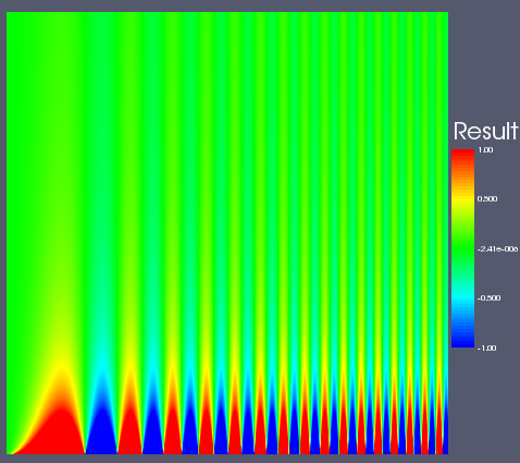
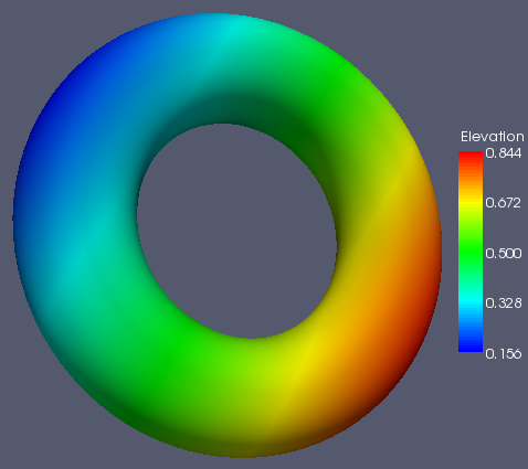
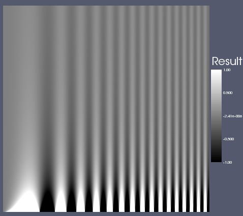
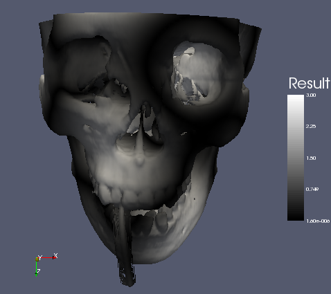
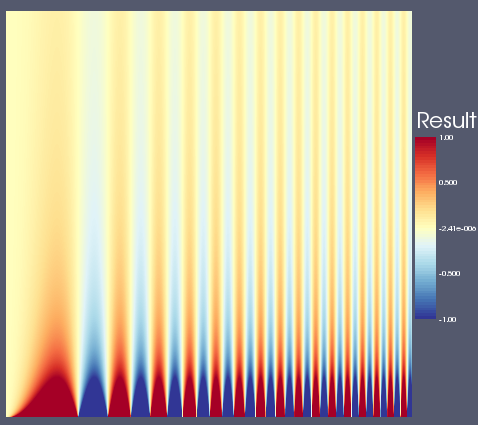
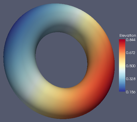
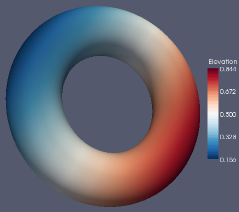
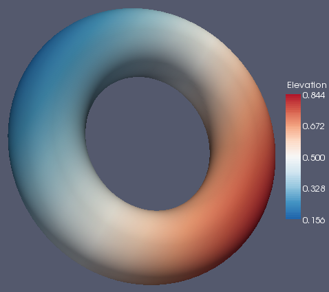
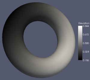
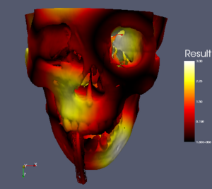
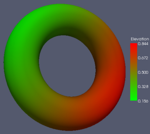
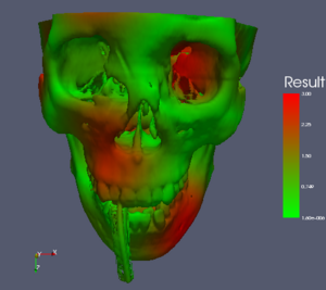
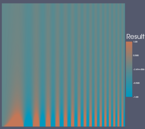
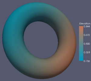
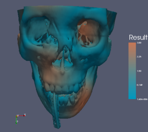
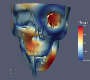
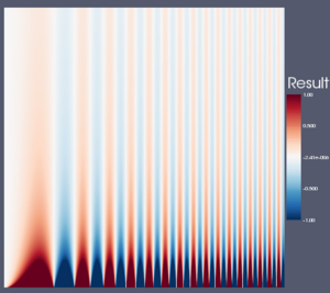
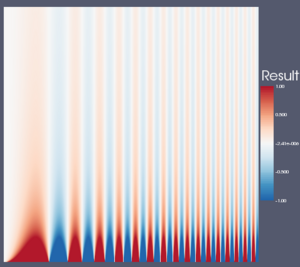
The rest of this Wiki page visits each color map in consideration and lists the pros and cons of each. It then shows image examples of the color map in use on three data sets. The first set is a spatial contrast sensitivity function. You will see frequency increasing to the right and contrast increasing to the bottom. This data set demonstrates the ability of the color map to show minimal contrast field changes. The second data set is a torus with the elevation filter applied to it. This data set can highlight banding caused by a color map. The third data set is a skull with a scalar field synthesized by summing the sine of the coordinates. I choose the scalar field in a way that would most interfere with the shading cues used to discern the shape of the object.
Rainbow Color Map
We all know and love (or hate) the rainbow color map. Adopted early on by physicists (who knew much more about electromagnetic radiation than human visual perception), it has become the rather unfortunate de-facto standard for visualization.
- Pros
-
- It is pretty. Although you will probably never see this mentioned as a factor in the literature, it can be pretty important in practice. Users will never choose ParaView if they feel our images are less "slick" than others.
- It has high ordinality. The rainbow passes through 5 distinct colors (blue, cyan, green, yellow, and red) and we could increase that to 6 if we chose to go down to violet. The colors visually separate the field into regions. Although the region boundaries are arbitrary and uneven, it nonetheless can simplify comparing regions.
- Cons
-
- The ordering is based on a physical phenomenon far removed from the visual perception of color. Experiments show that when human subjects are asked to order these colors, the results vary.
- Uneven perceptual changes. Equal increments in RGB or HSV space do not necessarily lead to equal perceptual increments. This leads to variation in widths of colors and occasional sharp transitions between colors, which leads to uneven bands in the color map. This can be actively misleading as there will be sharp transitions where there is none. It can also hide transitions that happen to fall within a band perceptually equivalent color. This is demonstrated in the spatial contrast sensitivity function below.
- Erratic luminance. The visual system perceives high spatial frequencies through changes in luminance, and luminance is often the best cue to ordering. However, the rainbow map is neither isoluminant nor ordered luminance. It goes from low luminance (blue) to high (cyan) to moderate (green) to high (yellow) to moderate (red).
That said, the rainbow color map is probably not as bad as indicated by the literature. The ordering is probably already ingrained in our users. We learn it pretty quickly. For example, my 6-year-old knows the colors of the rainbow in the proper order, consistently draws rainbows correctly, and has pointed out to me (without prompting) mistakes in other drawings. The perceptual problems introduced by the color map do not seem to bother many users either. I don't recall ever hearing a single complaint from users who go ballistic whenever data is inappropriately modified or misrepresented. In fact, one user told me that he was using rainbow pseudocoloring rather than grayscale on height field images knowing the perceptual problems involved with no explanation other than he simply "liked the colors". Perhaps the examples of bad mapping that we can easily construct do not often come to play in real-world problems.
Grayscale and Black-Body Radiation Color Maps
Isoluminant Color Maps
Brewer Color Maps
Table of Color Maps
For reference and comparison, here is a table comparing all the color maps with three different data sets. From left to right, the data sets are: a spatial contrast sensitivity function, a torus with an elevation field, and a skull with a distracting scalar field. From top to bottom, the color maps are: rainbow, grayscale, black-body radiation, isoluminant red-green, isoluminant CIE lab, and three maps derived from the ColorBrewer.

|

|

|

|
|

|

|

|
|

|
|
|
|
|
|

|

|
|
|

|

|
|

|

|
