Talk:Auto Generated Object Inspector Issues
Most of the changes Berk suggested were counter to the suggestions I made to Clint. Here's a breakdown of the reasons.
1. Array properties on one line
At some point, having the edit fields on the same line becomes too wide. There are properties with array lengths of 5 and 6. We could put in an arbitrary cut-off point. If there are more than 3, space them vertically. Doing so would not make a consistent gui.
Besides the width, there is a usability issue. Presenting the user with an array of edit fields forces them to look up what each input field is supposed to represent. Then, they have to remember what it was for the next time. If they forget, they have to look it up again. Even the current object inspector has this problem, since it labels the fields by array index. (Why do the labels start at zero instead of one?) This is why I wanted to add a label to the filter information in the xml. Then, center[0] could be labeled 'X' and so on. Placing the edit fields on the same row would make it difficult to label each field.
--Mark Richardson 16:34, 31 Mar 2006 (EST)
- What about this?
- It still uses less space. The common number of elements are: 2, 3 and 6. 3 elements almost have the following order: x, y, z. 6 elements almost always have the following order: xmin, xmax, ymin, ymax, zmin, zmax. Maybe the widget repsenting this could look like:
  Label:
      min     max
  x:
  y:
  z:
- Berk 11:58, 3 Apr 2006 (EDT)
- Making a provision for x,y,z and 3x4 matrices is a good idea - it's very common. In fact, a Qt component that handled these two things (with meaningful signals and slots) might be a good thing to have as well.
- David 12:43, 3 Apr 2006 (EST)
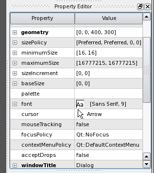
- If we're going to make a matrix to enter min/max points, we should use a table widget. Going back to the Qt designer as a reference, it displays a size on one line using a comma to separate the values. To edit the values, the user has to expand the item and set the values individually. I think they do that to avoid validating the comma separated list. We might be able to use a single edit field with comma separated values for the x, y, z values. There's still the problem of indicating the order the user should enter the values.
- --Mark Richardson 12:46, 4 Apr 2006 (EDT)
- The input elements in the form should have some space between them. (See my comments below.) This is purely an asthetic reason. Squishing the gui elements together is not pretty. It only partially fixes the problem anyway. Some objects, like the exodus reader, can be too large for the screen even with compressed elements.
- --Mark Richardson 12:46, 4 Apr 2006 (EDT)
2. Sliders for int properties with a lower and upper bound
A slider is useful for setting the value relative to the min and max. A slider is not very precise though. At certain resolutions, the slider may not be able to set all possible values. For instance, if the slider's range is 1000 and it is displayed in 300 pixels. As a default, I think int properties with lower and upper bounds should be represented using a spin box. Then, either leave the use of a slider to the custom panel or as a per property setting in the gui.
--Mark Richardson 14:34, 31 Mar 2006 (EST)
- While we're on the subject of lower and upper bounds, I think it's useful to have those bounds represented, or at the very least accessible. If we can't spare the space for a lower and upper label, we can have the limits accessible in a 'help' balloon you get when you hover over the slider or entry (or whatever). This might be good to have for all properties anyway.
- --David 14:44, 31 March 2006 (EST)
- What about a slider with a small (3-4 characters) entry on the right? The nice thing about sliders is that they do not require moving your hand away from the mouse to the keyboard to type values. If I am working with a mouse, I can make a few changes much more quickly with a mouse (or a spinbox but they take longer to change than sliders). On top of that, they provide immediate feedback on the type of data edited (int) and it's range. Photoshop (which is great for working with just the mouse) has a few really nice widgets. For example:
- Because photoshop manages to squeeze in so much interface into such a small space, it is a good example of what can be done to save space.
- Berk 11:47, 3 Apr 2006 (EDT)
- I like the way that ParaView does it as well ... the problem I have with the 'disappearing slider' solution (like the one on the left) is that they are only 'easy to manipulate' - they don't give the user any of the additional feedback (range, relationship of current value to that range) that an always-visible slider does.
- David 12:50, 3 Apr 2006 (EDT)
3. Check boxes on the right side of the label
Putting the checkbox on the right is not normal. For easy adoption by users, the gui should behave like other applications as much as possible. For checkbox properties, the label should be set in the checkbox widget, which will put the label to the right of the text. (I haven't found any QStyle settings that might reverse them). There are cases when a checkbox can be by itself. I've seen that mostly in some sort of table/tree view where the setting the checkbox changes is the column label.
--Mark Richardson 14:34, 31 Mar 2006 (EST)
- Berk - In general, I think check boxes and radio buttons have their boxes/circles to the left. Then, they always line up, because spacing is based on the box/circle.
- --David 14:44, 31 March 2006 (EST)
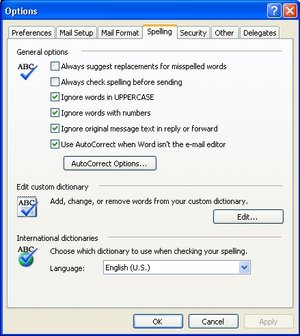
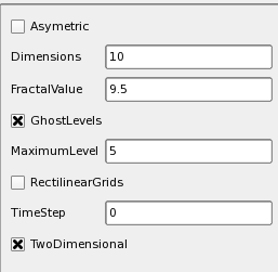
- However, they are usually not mixed with other widgets that have labels on the left. The current look is very inconsistent, with the editable field alternating between left and right. When I look at a property sheet, I expect the labels to be on one side. Or, at least, to have a separator between groups that have labels on different sides. This looks very inconsistent to me:
- This probably why the property editor in designer avoids check boxes but uses combo boxes instead.
- Berk 11:22, 3 Apr 2006 (EDT)
- The solution to this one is to allow ordering to be controlled by the XML file, as these checkboxes should probably be grouped together.
- David 12:50, 3 Apr 2006 (EDT)
- We should also add a string to the xml that can be used as the checkbox label. Instead of 'Capping,' we could display something like 'Cap The Ends Of The Cylinder.' This can help the user understand what the checkbox is for. It will also make the gui look better since the checkbox will appear to take up the whole line. We probably want to add the extra label for other properties too. Instead of 'TimeStep,' we could put in 'Time Step.'
- It would be nice to group properties together as well. If turning off a checkbox makes other settings unused, it would be nice to hide or disable those settings.
- --Mark Richardson 12:29, 4 Apr 2006 (EDT)
4. Colored buttons?
The accept button should not change color. We should use enabled/disabled to indicate if the button can be pressed.
--Mark Richardson 16:34, 31 Mar 2006 (EST)
- Plus, accept and undo/reset won't be in the object inspector to begin with.
- Tshead 17:38, 31 Mar 2006 (EST)
5. Saving space
Saving space is good, but we still don't want to go too far. The gui should still look normal. In Cubit, we saved some space by using a layout margin of 5 pixels and layout spacing of 4 pixels. I think the default is something like 11 and 6 for dialogs. That seems a bit big. We don't want to go too small either. There needs to be some space between the gui elements. Anyone have an idea for what spacing we use?
--Mark Richardson 17:24, 31 Mar 2006 (EST)
- What designer does looks good to me. Of course, this is what the object inspector used to look like :-)
- Berk 12:05, 3 Apr 2006 (EDT)


