Auto Generated Object Inspector Issues
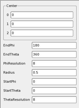
I have a few suggestions for improving the auto generated object inspector. This is the current paraq GUI for sphere source:
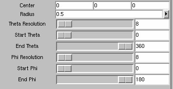
This one is paraview's:
My first suggestion is to collapse vectors (in this case Center) into one line the way paraview does. This saves a lot of vertical space. We could say any int or vector property with 2 or more elements (and range domain) should be represented as a horizontal vector of text entries (by the way, are we validating these entries).
Second, we could use scales for 1 element int properties that have a finite range.
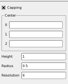
The cone GUI looks like this:
Can we change it such that the checkboxes show on the right of their label, aligned with the entry boxes? Proper alignment would make everything better. Also, can we make the default vertical size of the inspector window bigger? As it is, I have to resize it everytime to access more than 2 parameters.
- We should definitely make the vertical size bigger. We should probably only have the pipeline browser and object inspector in the left dock area. The object inspector should take up more than half the height as well. Maybe even 2/3.
- --Mark Richardson 17:18, 31 Mar 2006 (EST)
Also, there is no feedback when I change a property (such as Accept changing color or switch to enable from disabled).


