Pipeline Browser Ideas
Tree View Problems
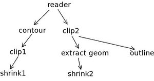
The following image shows why we can't use just an indent for fan out in a tree view.
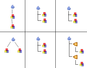
When only using an indent to show fan-out, both pipelines look the same to the user. Adding the split item lets the user see there are multiple outputs. The user will have to learn the meaning of the split item, but I think that is preferred to confusing the user.
- A tree view on the mac doesn't have the little lines connecting the items as shown in the image above. This may be a reason to implement our own hierarchy view. We would also be able to use the same model for the hierarchy view and the graph view.
- --Mark Richardson 15:43, 28 Mar 2006 (EST)
Alternate Views
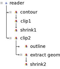
The following image shows an alternate hierarchy view:
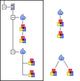
The view on the left would describe the pipelines on the right. If the pipeline branches had more filters connected to them, they would form a vertical chain under each of the branching filters. I added the server icon in there to get that discussion rolling too.
--Mark Richardson 17:13, 28 Mar 2006 (EST)
Design Proposals
Berk
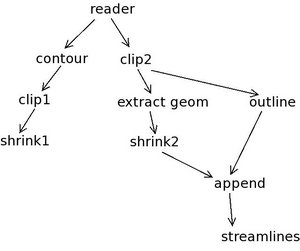
Here is an example pipeline. Pipelines of this size and branching level are common
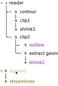
Based on the design we came up with at the summit, we can display this pipeline like this:
The rules are:
- Pipeline without fan-out: filter below it's input, connected with a line
- Pipeline with fan-out: indent once to show fan-out
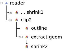
If a leaf is collapsed, it looks like:
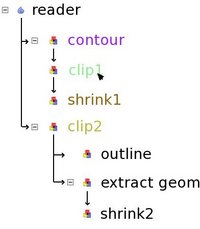
This makes it easy to see all pipeline attached to a single source. Note that I chose to display the last filter on the pipeline as the collapsed name. We can also use color highlighting. So when the user moves the pointer over clip1, all related filters are highlighted:
Here contour is input, shrink1 is output, clip2 is related (the clip planes of clip1 and clip2 are linked). Now, let's look at fan-in (multiple inputs). Here I added two filters to the pipeline:
One solution we discussed is to treat multiple input filters like new sources:
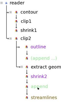
Here, the only way to find out what the inputs of append are is to bring the cursor over it. This might not work if the input are inside a collapsed pipeline. An alternative is the following:
In this case, the user is given a few clues:
- Append is connected to shrink2 (shown with an arrow)
- Append is connected to outline (shown with an arrow)
- The two instances of append refer to the same filter (they have the same name and they are highlighted green when the cursor moves over them)
- Streamlines is connected to append (arrow as well as highlight color)
I like the second solution better. I showed it to Utkarsh and Will, they agree. One potential improvement is to add some sort of mark to all instances of append to make it clear that there is another input somewhere.
David
Icon vocabulary
OK, here's one for you ... we know we need 'eyeballs' associated with the filters, but it seems to me that we may need other icons as well, though we should keep these to a minimumand I'd like to get the big yeah/nay on this one early. Our current design includes the idea of the 'current timestep' and the 'current variable', and as we increase the complexity of the UI, figuring out what this means is a real rats nest - especially for the user. We've stated that the 'current timestep' is controlled by 'the currently selected item in the current view', but that's not always correct. It seems to me it's going to be necessary to indicate which 'thing' is controlling the timestep, so here's a proposal:
Time Issues
- How do we reconcile different time in different data sets?
- If there are two possible time sources, how do we link them (get them going in lockstep)?
- How do we 'leave one behind, and advance the other?
Note: there is a very similar issue with 'current variable' Note: the simplist case - in which there are two input exodus files, is common. There are all sorts of problems with matching timesteps in different datasets. We should get a bead on this early.
- Rather than treating sources as "time" sources, treat them as time consumers - define a single global time (a real number), and connect it (via linking) to source inputs. To create "local" times for sources, link the global time through a third filter, one that can offset and scale real numbers. Tshead 20:58, 3 Apr 2006 (EDT)
