Pipeline Browser Ideas
Tree View Problems
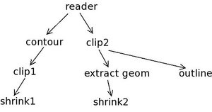
The following image shows why we can't use just an indent for fan out in a tree view.
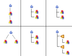
When only using an indent to show fan-out, both pipelines look the same to the user. Adding the split item lets the user see there are multiple outputs. The user will have to learn the meaning of the split item, but I think that is preferred to confusing the user.
- A tree view on the mac doesn't have the little lines connecting the items as shown in the image above. This may be a reason to implement our own hierarchy view. We would also be able to use the same model for the hierarchy view and the graph view.
- --Mark Richardson 15:43, 28 Mar 2006 (EST)
What does a hierarchy mean?
When I look at Mark's diagram, it seems clear to me that we're asking the wrong question. Let's turn the problem around, and look at things from the user standpoint.
Take this simple test: Look at a Pipeline Browser representation, and without thinking about (code, etc.) implementation, draw the graph that it represents. Think as a user, not a programmer.
The Test
What does this Pipeline Browser representation show? To me, it logically represents this filter graph.
What does this Pipeline Browser representation show? To me, it shows this filter graph.
Conclusion
In other words, when I look at the Pipeline Browser hierarchy, I think it naturally leads to 'indentation means connection'. If we do it this way, I think we solve several problems - the thing makes sense, and I think it's easy to understand. Of course, this comes at the sacrifice of width - large chains of filters will be 'wide', because we always indent. Remember - we decided not to indent during our design discussion, because we didn't want these things becoming wide.
To me, the 'indent means connection' design makes sense, and it makes the whole widget easier to understand. Because of this, I like it for the first rev. We can, through user testing see how long a typical pipeline becomes (how wide they become), and address that problem.
--David 15:30, 28 March 2006 (EST)
Alternate Views
The following image shows an alternate hierarchy view:
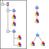
The view on the left would describe the pipelines on the right. If the pipeline branches had more filters connected to them, they would form a vertical chain under each of the branching filters. I added the server icon in there to get that discussion rolling too.
--Mark Richardson 17:13, 28 Mar 2006 (EST)
Design Proposals
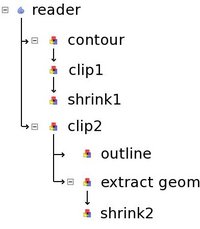
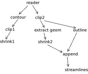
Here is an example pipeline. Pipelines of this size and branching level are common
Based on the design we came up with at the summit, we can display this pipeline like this:
The rules are:
- Pipeline without fan-out: filter below it's input, connected with a line
- Pipeline with fan-out: indent once to show fan-out
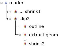
If a leaf is collapsed, it looks like:
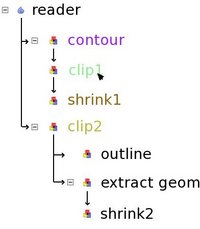
This makes it easy to see all pipeline attached to a single source. Note that I chose to display the last filter on the pipeline as the collapsed name. We can also use color highlighting. So when the user moves the pointer over clip1, all related filters are highlighted:
Here contour is input, shrink1 is output, clip2 is related (the clip planes of clip1 and clip2 are linked). Now, let's look at fan-in (multiple inputs). Here I added two filters to the pipeline:
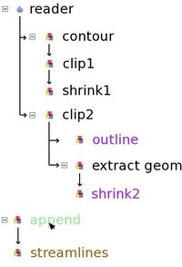
One solution we discussed is to treat multiple input filters like new sources:
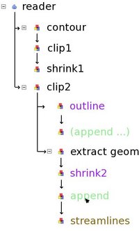
Here, the only way to find out what the inputs of append are is to bring the cursor over it. This might not work if the input are inside a collapsed pipeline. An alternative is the following:
In this case, the user is given a few clues:
- Append is connected to shrink2 (shown with an arrow)
- Append is connected to outline (shown with an arrow)
- The two instances of append refer to the same filter (they have the same name and they are highlighted green when the cursor moves over them)
- Streamlines is connected to append (arrow as well as highlight color)
I like the second solution better. I showed it to Utkarsh and Will, they agree. One potential improvement is to add some sort of mark to all instances of append to make it clear that there is another input somewhere.


