Pipeline Browser Ideas
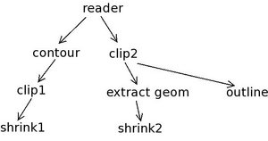
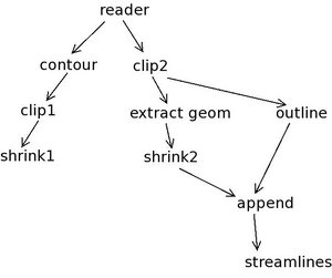
Here is an example pipeline. Pipelines of this size and branching level are common
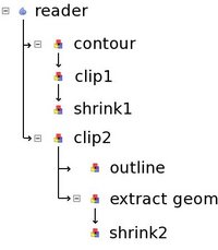
Based on the design we came up with at the summit, we can display this pipeline like this:
The rules are:
- Pipeline without fan-out: filter below it's input, connected with a line
- Pipeline with fan-out: indent once to show fan-out
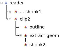
If a leaf is collapsed, it looks like:
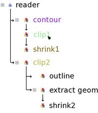
This makes it easy to see all pipeline attached to a single source. Note that I chose to display the last filter on the pipeline as the collapsed name. We can also use color highlighting. So when the user moves the pointer over clip1, all related filters are highlighted:
Here contour is input, shrink1 is output, clip2 is related (the clip planes of clip1 and clip2 are linked). Now, let's look at fan-in (multiple inputs). Here I added two filters to the pipeline:
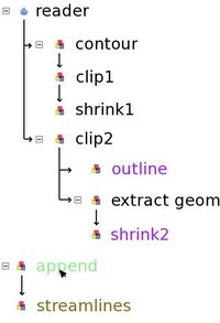
One solution we discussed is to treat multiple input filters like new sources:
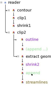
Here, the only way to find out what the inputs of append are is to bring the cursor over it. This might not work if the input are inside a collapsed pipeline. An alternative is the following:
In this case, the user is given a few clues:
- Append is connected to shrink2 (shown with an arrow)
- Append is connected to outline (shown with an arrow)
- The two instances of append refer to the same filter (they have the same name and they are highlighted green when the cursor moves over them)
- Streamlines is connected to append (arrow as well as highlight color)
I like the second solution better. I showed it to Utkarsh and Will, they agree. One potential improvement is to add some sort of mark to all instances of append to make it clear that there is another input somewhere.
